Why I Chose the Andika Font for The Rabbit in the Moon: Dyslexia-Friendly Design, Early Readers, and Accessible Storytime
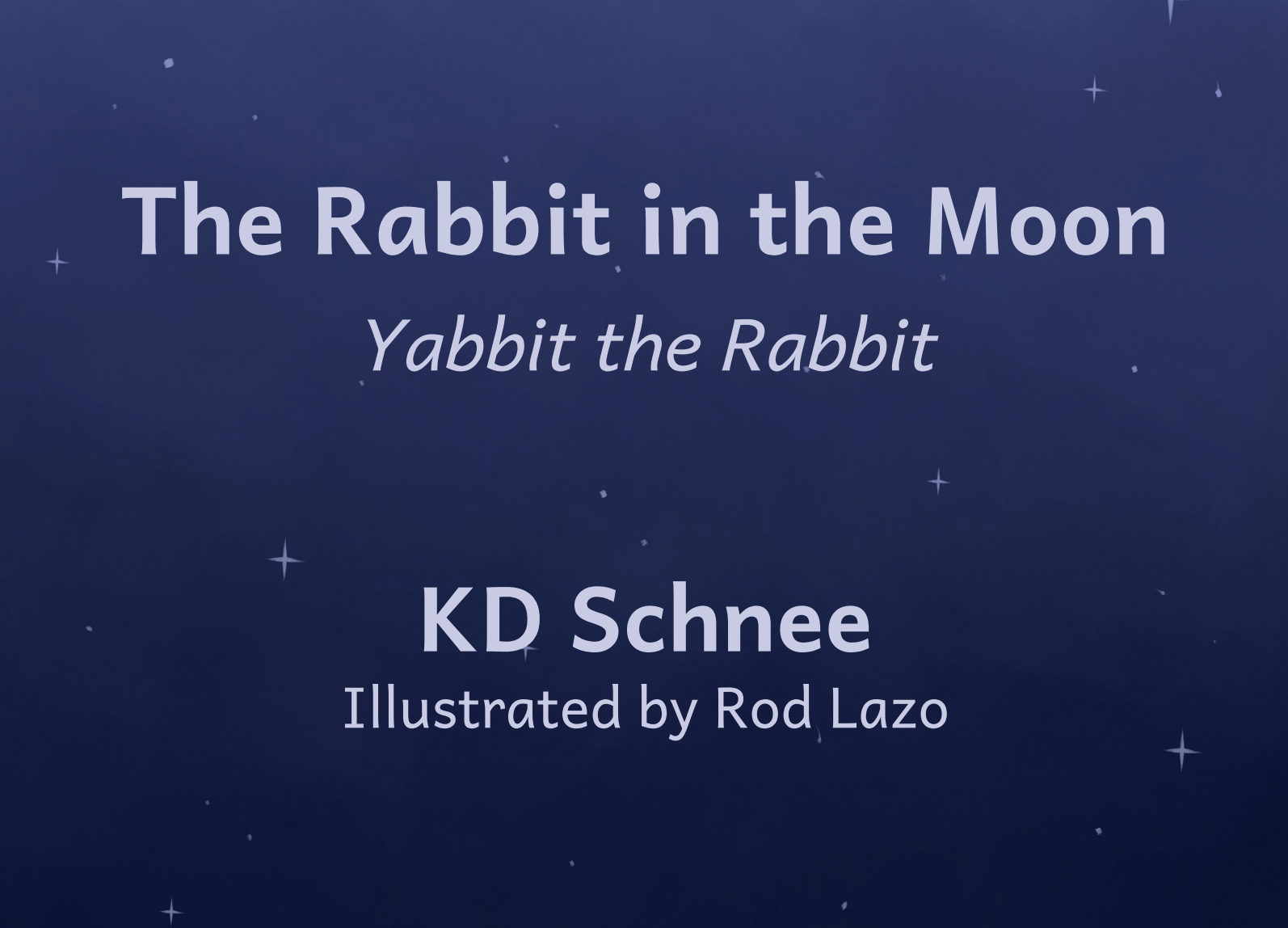
The font in a children’s book is not just a design choice. It can change how welcoming the page feels to a young reader.
I chose the Andika font because I wanted The Rabbit in the Moon to feel beautiful, readable, and welcoming from the first page.
That may sound like a small design detail. It is not.
In a picture book, every choice matters. The words matter. The illustrations matter. The color matters. The pacing matters. And yes, the font matters too. For a young child, a page is not only something to read. It is something to enter. If the letters feel crowded, decorative, confusing, or visually noisy, the child may have to work harder before the story even begins.
I did not want that for Yabbit.
The Rabbit in the Moon is a story about hesitation, courage, and tiny brave hops. It was created for children who sometimes need the first step to feel smaller. So when it came time to choose the font, I wanted the design of the book to support the same emotional promise as the story itself.
Come closer.
Take your time.
This page is safe to enter.
That is why I chose Andika.
What is the Andika font?
Andika is a sans-serif font designed especially for literacy use. It was developed by SIL International, an organization known for language, literacy, and font development around the world. The name “Andika” comes from the Swahili word for “to write,” which feels especially fitting for a book built around helping children find the courage to begin.
What makes Andika stand out is not that it looks flashy. It is the opposite. Andika is calm. Clear. Open. Its letterforms are designed to be easy to perceive and less likely to be confused with one another.
That matters for early readers.
Young children are still learning how letters behave. They are learning that shapes connect to sounds, sounds connect to words, and words carry meaning. A font that keeps letterforms clear can make that process feel less cluttered.
For children with dyslexia or other reading differences, clarity matters even more. A font alone cannot remove the challenge of dyslexia, and I would never claim that it can. But thoughtful typography can reduce unnecessary visual barriers. It can make the page feel more approachable. It can help the book feel less like a test and more like an invitation.
Why font choice matters in children’s books
Parents often notice the cover first. Children notice the character. Teachers may notice the theme. But once the book is open, typography becomes part of the reading experience.
A font can make a page feel playful, elegant, old-fashioned, silly, formal, crowded, gentle, or clear. In a children’s book, that feeling matters because the child is not only absorbing the story. They are also forming a relationship with reading.
If the words feel hard to look at, the child may pull away before the story has a chance to reach them.
That is why I think picture book typography should never be treated as an afterthought. The font should serve the child. It should support the story without calling too much attention to itself. It should be clear enough for adults reading aloud, comfortable enough for early readers beginning to follow along, and respectful of children who process text differently.
In The Rabbit in the Moon, I wanted the font to feel like a steady hand on the page. Present, clear, and kind.
Why Andika felt right for Yabbit
Early in the process of creating Yabbit the Rabbit and The Rabbit in the Moon, I kept returning to the same question: how do we make the whole book feel emotionally safe?
Not just the story. The whole experience.
Yabbit is a hesitant character. He pauses before something big. He worries. He needs time. Children who hesitate often know that feeling in their bodies before they can explain it in words.
So the book needed to feel accessible in both message and design.
Andika fit that mission because it does not try to impress the reader with decorative complexity. It does what I needed it to do: it lets the words breathe. It keeps the page clean. It gives the story room to be heard.
That is especially important in a rhyming picture book. Rhyme needs rhythm. Rhythm needs visual space. When a parent reads aloud, the words should feel natural. When a child follows along, the letters should feel friendly enough to revisit.
Andika helped create that balance.
My personal reason for caring about dyslexia-friendly design
This choice was also personal.
My best friend growing up had dyslexia. From a young age, I understood that reading was not the same experience for every child. Letters that seemed easy for one reader could feel confusing, slippery, or exhausting for another. Reading could take patience. It could take courage. It could take a kind of persistence many adults never fully see.
That stayed with me.
So when I created The Rabbit in the Moon, I did not want accessibility to be a marketing phrase added at the end. I wanted it to be part of the design conversation from the beginning. The story was already about helping hesitant children feel brave enough to continue. The font needed to respect that same child.
Choosing Andika was one way to honor that.
Not because it magically solves dyslexia. Not because one font works for every reader. But because it reflects a deeper value: children deserve books that consider how reading actually feels.
Is Andika a dyslexia font?
This is where the answer needs to be careful.
Andika is not a “dyslexia cure” font. No font cures dyslexia. Dyslexia is not a design inconvenience that disappears when the letters change shape.
But Andika is a literacy-focused font, and many of the qualities that make a font easier for beginning readers can also support readers with dyslexia or reading differences. Clear letterforms. Open spacing. Sans-serif simplicity. Low visual clutter. Letters that are easier to tell apart.
Those things matter.
The research around dyslexia-friendly fonts is more nuanced than many headlines suggest. Some studies show that font choice can affect readability for people with dyslexia, especially when comparing clear, roman, sans-serif fonts against more decorative, serif, or italic fonts. Other research suggests that specialized dyslexia fonts do not consistently outperform common readable fonts like Arial or Verdana.
That is why I do not describe Andika as a miracle solution.
I describe it as a thoughtful, literacy-first design choice.
For The Rabbit in the Moon, that was exactly the point. I wanted a font that aligned with accessibility principles without making exaggerated promises.
What makes a font easier for many young readers?
A readable children’s book font usually has a few important qualities.
It should have clear letter shapes. The letters should not look too similar to one another. The spacing should give words room to breathe. The font should not be overly decorative. Italics should be used carefully, if at all. The text should have enough contrast to be easy to see, but not feel harsh on the page.
Andika supports many of those goals.
It is simple without being cold. It is readable without being sterile. It feels child-friendly without becoming cartoonish. That is a hard balance to find.
For The Rabbit in the Moon, I also wanted the font to sit comfortably with Rod Lazo’s illustrations. The artwork has warmth, feeling, and atmosphere. A more decorative font could have competed with the illustrations. A more rigid font could have felt emotionally out of place. Andika gave the words clarity while allowing the art to carry its full emotional weight.
For a deeper look at how the illustrations carry emotional meaning alongside the words, read: https://www.yabbitrabbit.com/parent-resources/rabbit-in-the-moon-illustrations-help-children-read-feelings?utm_source=chatgpt.com
That is what good typography should do in a picture book. It should help the story arrive.
Accessibility is not only about children with dyslexia
Dyslexia was one important reason I cared about this choice, but accessibility is broader than one reading difference.
A clear font can also help beginning readers, tired parents reading at bedtime, grandparents reading aloud, teachers sharing the book in a classroom, and children who are not reading independently yet but are beginning to notice words on the page.
Storytime is often shared.
A parent reads. A child follows the pictures. A sibling listens nearby. A teacher holds the book up to a group. A counselor pauses on a page and asks what the character might be feeling. In all of those settings, clarity helps.
The goal is not to make the book feel clinical. The goal is to make it easier to enter.
That matters because The Rabbit in the Moon is an emotional story. If the child is using all their effort just to visually process the text, there is less room for the feeling of the story to land. The font should not become another obstacle.
How Andika supports the message of The Rabbit in the Moon
The Rabbit in the Moon is about courage that begins small.
Yabbit does not leap into bravery all at once. He hesitates. He pauses. He feels the size of the journey before him. Snail, steady and persistent, helps the story keep moving without shaming Yabbit for needing time.
That same spirit guided the design of the book.
Andika supports the idea that children deserve a gentle entry point. The text should not rush them. The page should not overwhelm them. The book should say, visually and emotionally, “You can begin here.”
That is why the font choice matters so much to me.
A tiny brave hop is not only something that happens in the story. It is part of how I wanted the reading experience to feel. Clear type. Warm illustrations. Emotional language. A story that gives children room to pause and still continue.
The design and the message are working together.
What parents should know about dyslexia-friendly books
If you are looking for books for a child with dyslexia or reading challenges, font is one helpful factor, but it is not the only one.
Look for books with clear spacing, readable type, strong contrast, supportive illustrations, and a story that does not make reading feel like a performance test. For many children, emotional safety matters as much as visual design. A child who already feels discouraged by reading needs books that feel welcoming, not books that make them feel measured.
Picture books can be especially helpful because the illustrations carry meaning too. The child can follow the story through faces, color, mood, and action while also hearing the words read aloud. That shared experience can reduce pressure.
If you want to think more broadly about how picture books support children beyond the words on the page, this companion guide may help: https://www.yabbitrabbit.com/parent-resources/what-should-a-child-learn-from-a-picture-book
Why this choice matters to parents, teachers, and counselors
Parents want books their children will return to. Teachers want books that work in a classroom. Counselors want stories that open gentle conversations. Grandparents want read-alouds that feel meaningful and easy to share.
Typography affects all of that more than people realize.
If a book is hard to read aloud, the adult feels it. If the page is visually crowded, the child feels it. If the text and art are fighting for attention, the story loses some of its warmth.
Andika helped The Rabbit in the Moon feel clear, calm, and readable. It supported the rhythm of the text and left space for the illustrations to do their emotional work. Most importantly, it aligned with the heart of the book.
A story about hesitant children should not be designed in a way that makes hesitant readers feel pushed away.
It should open the door.
Why I still believe Andika was the right choice
The more I have learned from parents, teachers, and readers, the more confident I feel about this decision.
Andika was not chosen because it was trendy. It was not chosen to make a claim I could not support. It was chosen because it matched the mission of The Rabbit in the Moon: to make courage feel accessible.
Accessible in the story.
Accessible in the illustrations.
Accessible in the emotional language.
Accessible in the way the words appear on the page.
Every time I see “Face Fear, Feel Brave” in Andika, I think about the children who need a little more time. The children who hesitate before trying. The children who want to read but find the page difficult. The children who need stories that meet them with patience.
That is who Yabbit is for.
And that is why the font matters.
Buy the Book
If you are looking for a beautifully illustrated picture book that considers both emotional accessibility and reading accessibility, The Rabbit in the Moon belongs on your shelf.
Yabbit is not fearless. He pauses. He worries. He needs time. But with Snail’s steady persistence beside him, he learns that courage does not have to arrive all at once. It can begin with one tiny brave hop.
The book’s use of the Andika font is part of that same promise: clear, thoughtful, welcoming design for children who deserve stories that feel easier to enter.
For parents, teachers, grandparents, and counselors, The Rabbit in the Moon offers more than a bedtime story. It gives children language for hesitation, fear, persistence, support, and brave little beginnings.
The Rabbit in the Moon is a meaningful investment in your child’s emotional growth.
FAQs
What is the Andika font?
Andika is a sans-serif font designed especially for literacy use. It was created to support clear, readable letterforms, especially for beginning readers and language learners.
Is Andika a dyslexia-friendly font?
Andika is often discussed in the context of dyslexia-friendly reading because it has clear letterforms, simple shapes, and a literacy-first design. It is important to be honest, though: no font cures dyslexia, and no single font works for every reader. Andika is best understood as a thoughtful readability choice.
Why did The Rabbit in the Moon use Andika?
I chose Andika because I wanted The Rabbit in the Moon to feel beautiful, clear, inclusive, and approachable. The story is about hesitant children finding courage in small steps, so the typography needed to support that same feeling of accessibility.
What makes a font easier for children with dyslexia?
Many dyslexia-friendly design guides recommend clear fonts, generous spacing, readable sizing, strong contrast, and avoiding overly decorative or italicized text. A good font should reduce unnecessary visual clutter and make the page easier to enter.
Does font choice really matter in a children’s book?
Yes. Font choice affects how comfortable a page feels, how easy it is for an adult to read aloud, and how approachable the words may feel to a child beginning to notice or read text. It is not the only design choice that matters, but it is an important one.
Is The Rabbit in the Moon only for children with dyslexia?
No. The Rabbit in the Moon is for children who hesitate, worry, avoid starting, or need courage made smaller. Its clear typography can support many readers, but the story’s emotional message is useful for any child learning to face fear and take one tiny brave hop.
What should parents look for in accessible children’s books?
Look for clear typography, readable spacing, supportive illustrations, strong contrast, and a story that feels emotionally safe. The best accessible books do not only make words easier to see. They make the reading experience feel more welcoming.