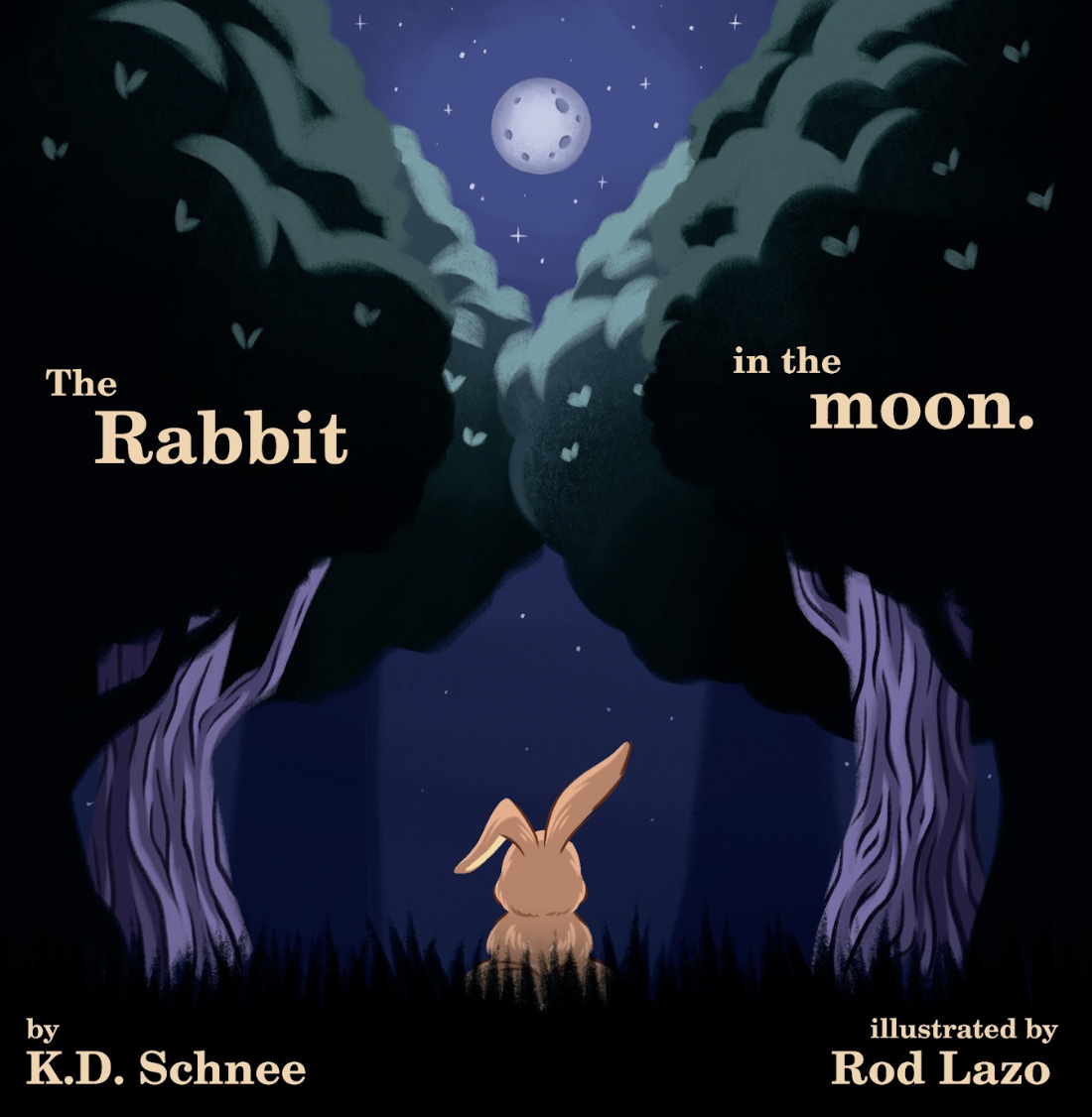
Why I Chose the Andika Font for The Rabbit in the Moon: Dyslexia-Friendly Design, Early Readers, and Accessible Storytime
The font in a children’s book is not a small detail. I chose Andika for The Rabbit in the Moon because it was designed for literacy, beginning readers, and clear letterforms. Here is why that matters for children with dyslexia, early readers, and families who want storytime to feel beautiful, inclusive, and easier to enter.